With JAES.tv I wanted to satisfy several key goals for my personal website to handle:
- Load quickly
- Simple but expandable
- Have a unique experience for everything page
- Easy to use and understand
With these in mind, I set out to design my sites experience.
Goal #1: Load quickly
Loading a website quickly is something that's dependant on both how a site is designed, but also how the tech powering it is used. I decided to make a static website as this requires little processing, and lets me focus more on content than programming.
Goal #2: Simple but expandable
I wanted a design that was simple, but could be easily expanded upon. As you can see below, in May of 2018 I had originally thought of showing header images on the post lists.
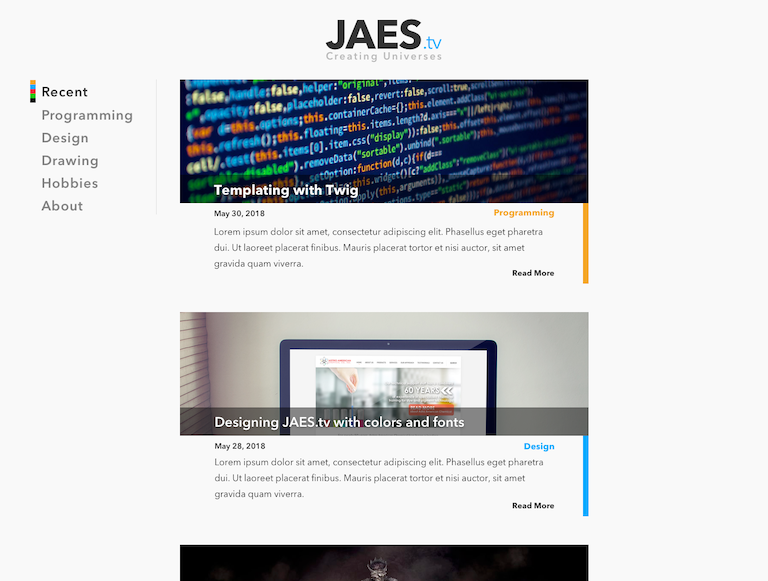
The problem I found with this design is that it looked similar to many marketing blogs I've seen before. More than that, the individual posts, depicted below, seemed busy due to the right bar running along side the content.
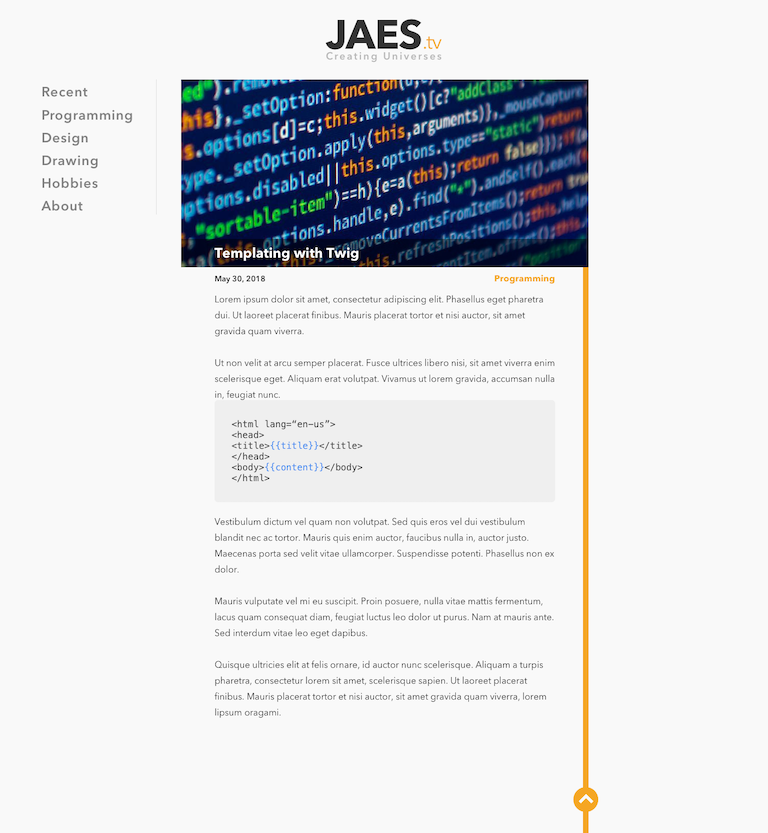
I even did a version similar to this, with a smaller header image, and scaling full page width. This presents some technical challenges with regard to how you frame the header image with scaling width.
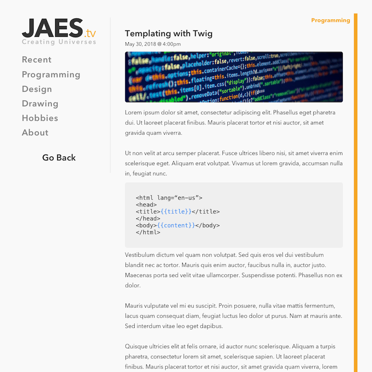
I settled on a design that had very basic summaries in the post lists (which you see on the homepage), with content the primary focus when you go to each post.
Goal #3: Have a unique experience for everything page
Achieveing this goal required some forethought. I wanted anyone visiting my site to experience something unique for every page they go on.
For posts this was fairly easy: Make the header image truly unique
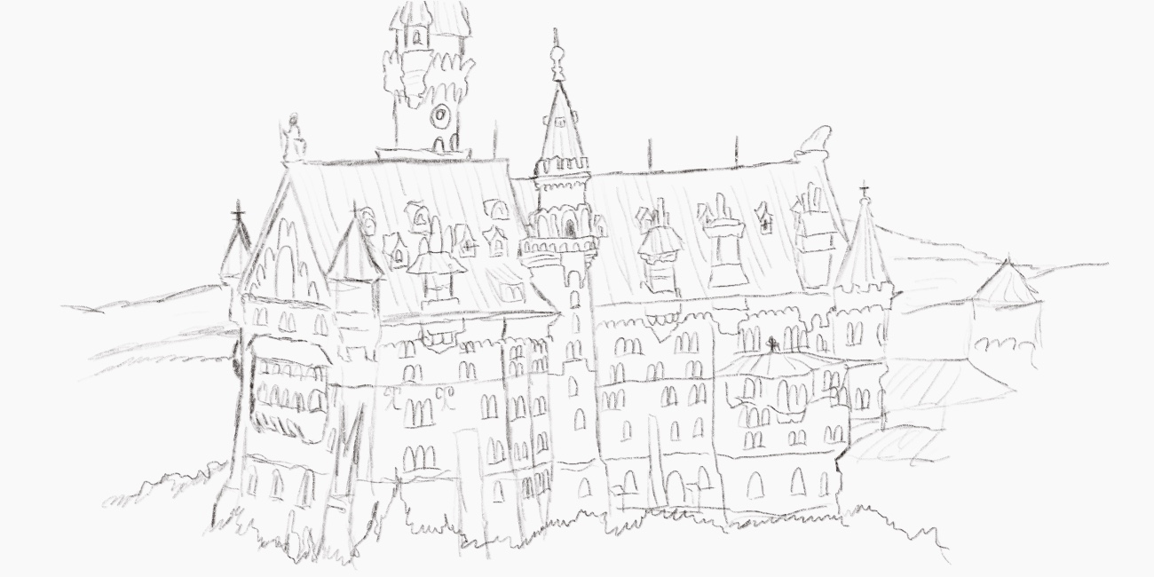
To accomplish this, I simply would draw all my header images. While this does require considerably more effort, but the payoff is that I get to draw more which lets me improve my drawing skills for things I may not draw, such as the castle depicted above.
The post lists were a bit more tricky. I settled on a subtle experience: the domain extension on the logo would slowly change between each categories color as you sit on the page.

Goal #4: Easy to use and understand
Ease of use is often a tricky thing to accomplish. This is mainly because you can never tell how others will use your tools, sites, etc. Because of this, I wanted to eliminate distractions and get straight to the content.
In addition to this, I focused on vastly different colors to categorize everything. My hope is that this would give the understanding of what each post is in the post lists by the little bar.
An improvement I may explore to this is to add what the categories are to the bars in some fashion. This would benefit anyone arriving to the site the first time since they'd be immediately able to tell what the colors mean.
The Future
Some things have already been adjusted on the sites design. I've added dates to the post lists, and a Favicon. But I won't be stopping there, I hope to iterate on the design over time, helping to increase its usability, but still maintaining my goals I set out to achieve.